

Hot

Hot

-91% Hot
-92% Hot
Related posts
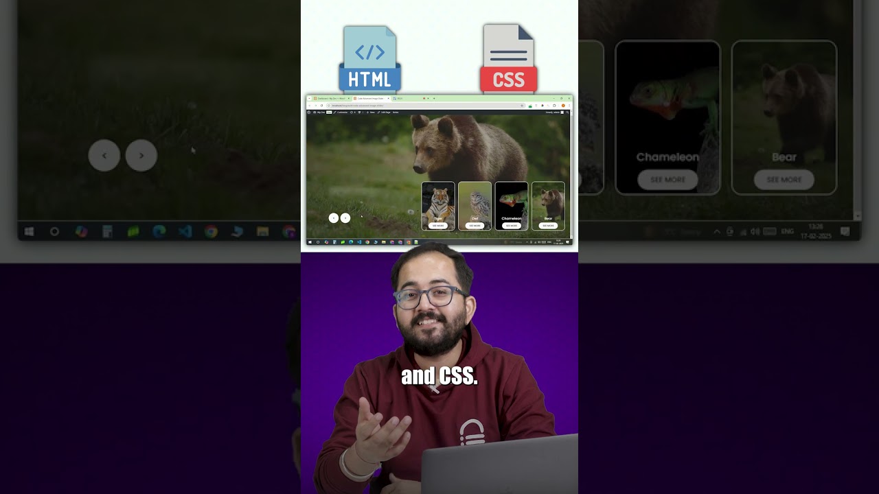
Create Advanced Image Slider in WordPress
Introduction to Image Sliders in WordPress
Image sliders are a vital component of modern web design, enhancing aesthetics and user enga...

EU Data Act Disrupts SaaS and AI with 2-Month Subscription Cancellations
The recent implementation of the EU Data Act is set to reshape the landscape of Software as a Service (SaaS) and Artificial Intelligenc...

AI Powered WordPress Plugin Development – WP Chattogram Monthly Meetup January 2025
Exploring AI-Powered WordPress Plugin Development: Insights from the WP Chattogram Monthly Meetup
Introduction to AI in WordPress Plugi...
Shopify VS WordPress | Which Platform Is Best For Your Online Store? A Comprehensive Compression#yt
Shopify vs. WordPress: Which Platform is Best for Your Online Store?
When it comes to setting up an online store, the choice of platfor...

Surfshark Antivirus Upgrade: ARM Support, New UI, and VPN Integration
When it comes to safeguarding your digital life, the latest Surfshark antivirus upgrade is generating buzz in the tech community. This ...

Top AI Expert Reveals FREE POWERHOUSE Tools You Need in 2025
Unleashing the Future: Must-Have Free AI Tools for 2025
As we approach 2025, the landscape of artificial intelligence continues to evol...

Bikin website pake template gratis? Emang ada? #fyp #wordpress #websitepemula #websitetanpacoding
Membuat Website dengan Template Gratis: Apakah Itu Mungkin?
Membangun website dapat menjadi salah satu langkah terpenting dalam mengemb...

AI WordPress Builder🔥FREE !! Create Your FREE WordPress Website in Minutes
Unlocking the Power of AI: Build Your WordPress Website for Free in Minutes
Introduction to AI WordPress Builders
In today’s digital la...

House Committee Probes PayPal on Chinese Money Laundering, Fentanyl Ties
Understanding the House Committee’s Investigation into PayPal: A Deep Dive
In recent times, PayPal, a leader in online payment solution...

Google’s Sensible Agent Reframes Augmented Reality (AR) Assistance as a Coupled “what+how” Decision—So What does that Change?
Understanding Google’s Sensible Agent and Its Impact on Augmented Reality
As technology continues to evolve, Google’s Sensible Agent is...
What is Prompt Engineering?
Understanding Prompt Engineering: An Essential Skill in AI Development
Introduction to Prompt Engineering
In the rapidly evolving world...
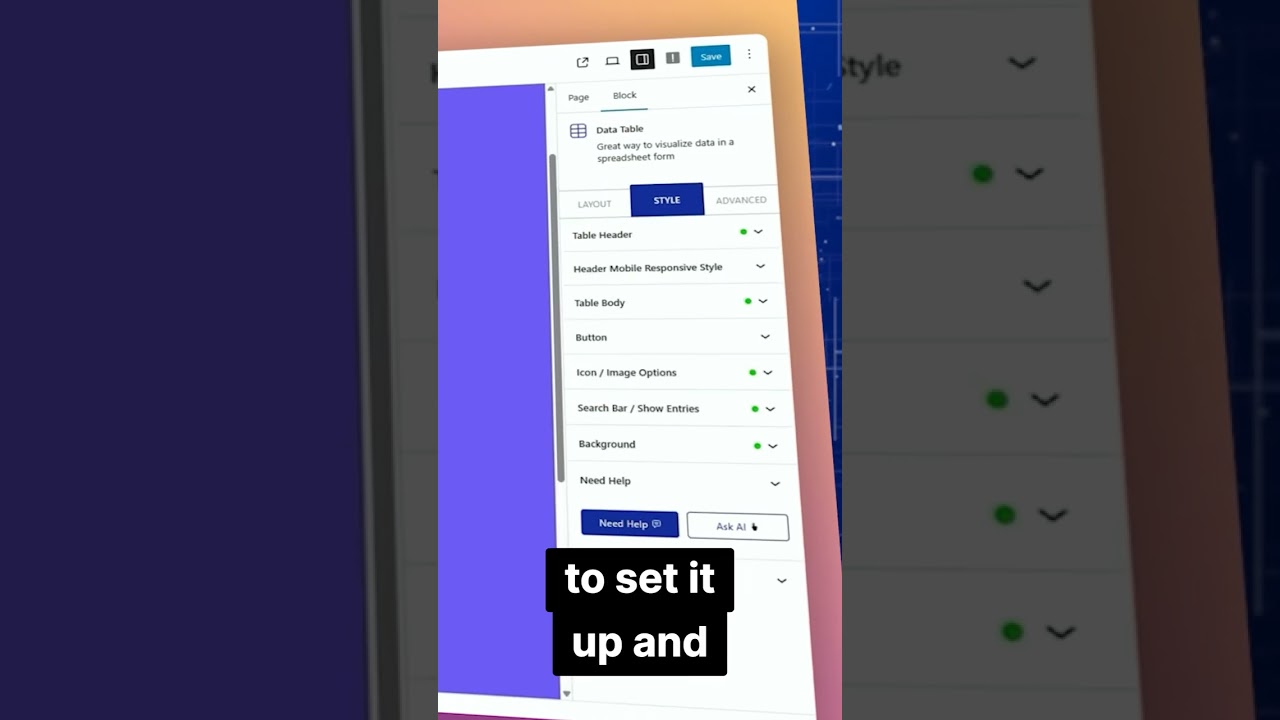
Table Block WordPress Tables Made Easy
Streamlining Table Creation in WordPress with Table Block
Creating tables in WordPress has traditionally been a time-consuming task. Us...
