
Blog
What Is HSL And Why Designers Should Master It
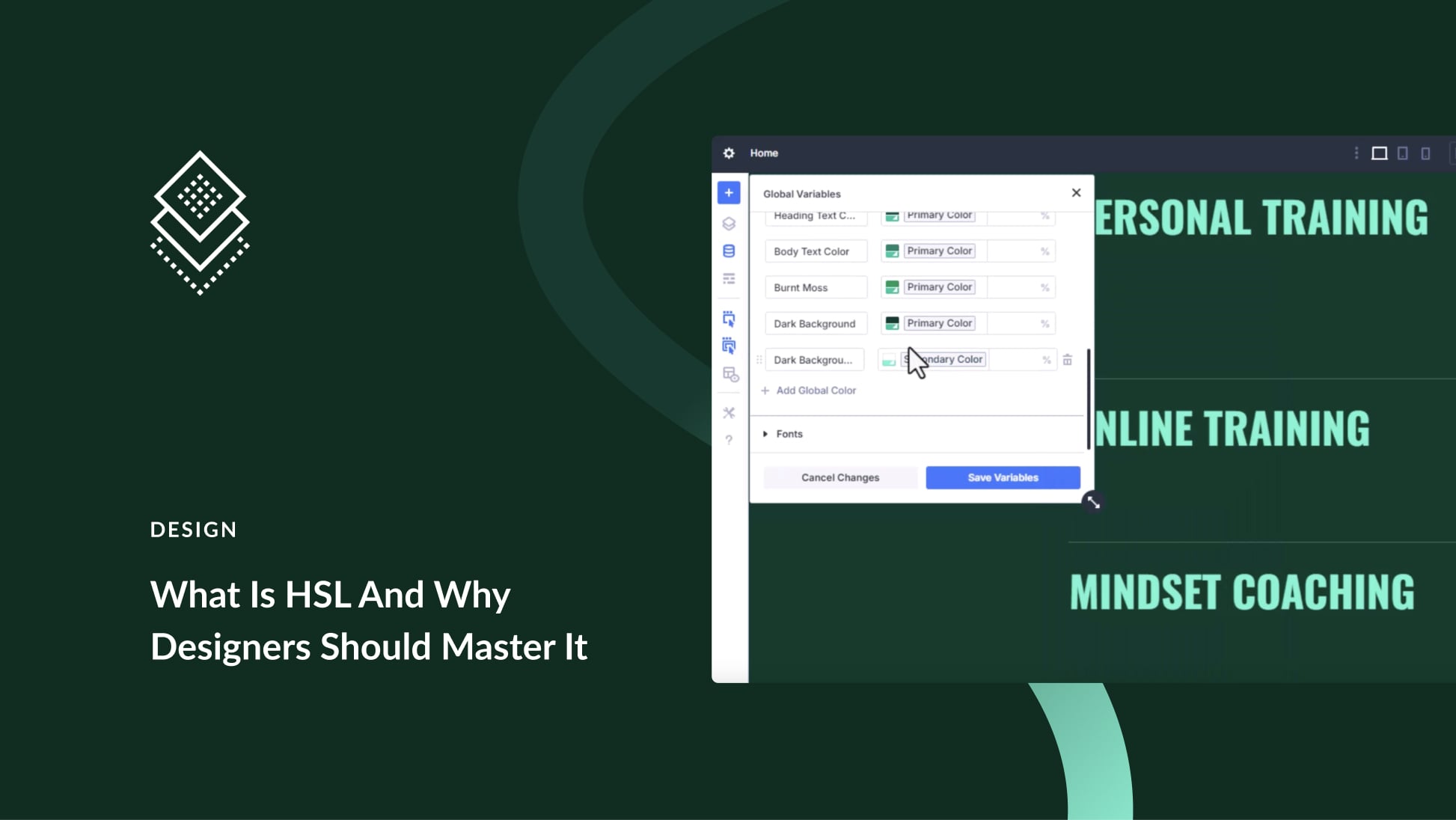
Understanding HSL: A Vital Tool for Designers
In the world of design, color is an essential element that can influence emotions, thoughts, and actions. One of the most effective ways to represent color in digital design is through HSL, which stands for Hue, Saturation, and Lightness. Understanding HSL is crucial for designers looking to create visually striking and harmonious compositions.
What is HSL?
HSL is a color representation model that simplifies the way we think about colors. Unlike traditional RGB (Red, Green, Blue) values, which can be complex and challenging to manipulate, HSL breaks down colors into three distinct components:
-
Hue: This refers to the color itself and is represented on a circular scale from 0 to 360 degrees. Each degree corresponds to a different color; for instance, 0 or 360 degrees represents red, 120 degrees represents green, and 240 degrees represents blue.
-
Saturation: This measures the intensity or purity of a color. A saturation level of 0% means the color is completely desaturated (greyscale), while 100% indicates a fully vibrant color.
- Lightness: This describes the brightness of a color on a scale from 0% (black) to 100% (white). A lightness value of 50% typically represents the pure hue.
Why Designers Should Master HSL
Simplified Color Manipulation
One of the primary benefits of the HSL model is its intuitive approach to color manipulation. Designers can easily adjust hue, saturation, and lightness levels to create color schemes that resonate with their artistic vision. Whether you’re looking to tone down a vibrant color or brighten a muted one, HSL provides straightforward controls that can help achieve the desired effect.
Enhanced Color Harmony
Color harmony is pivotal in design; it creates a sense of balance and appeal. With HSL, designers can experiment with variations of a single hue to generate a palette that feels cohesive. For instance, tweaking the saturation and lightness values while keeping the hue constant can produce different shades and tints, allowing for seamless integration within a design project.
Versatile Application
HSL is not confined to specific types of design; it can be used across various platforms—web design, app design, branding, and even print media. This versatility makes it a valuable skill set for contemporary designers, as it ensures they can create cohesive visual experiences irrespective of the medium.
How to Utilize HSL in Your Design Projects
1. Color Wheel Exploration
Begin by familiarizing yourself with the color wheel based on HSL values. Understanding how colors relate to each other—complementary, analogous, or triadic—will help you create visually pleasing designs. Experimenting with different hues can spark creativity.
2. Create a Mood Board
A mood board is an effective way to gather inspiration. Select colors using the HSL model and arrange them based on their hue, saturation, and lightness. This exercise not only clarifies your vision but also allows you to determine what colors work well together.
3. Experiment with Tints and Shades
When designing, don’t shy away from creating tints (adding white) and shades (adding black) of a specific hue. This manipulation can provide depth and dimension to your work, making it more engaging for the audience. Experimenting with HSL makes this process seamless.
4. Test Color Combinations
Before finalizing a color palette, test it against different backgrounds and within diverse design contexts. HSL allows for quick adjustments, making it easier to find the perfect balance. Fine-tuning the saturation and lightness of your colors can lead to improved readability and overall visual impact.
Common HSL Mistakes and How to Avoid Them
Ignoring Color Contrast
One frequently overlooked aspect of utilizing HSL is not paying attention to color contrast. Without sufficient contrast between text and background colors, designs can become difficult to read. Always check contrast ratios to ensure the accessibility of your work.
Overcomplicating Palettes
While using HSL can simplify color manipulation, it’s important to avoid overwhelming viewers with too many colors. A cohesive scheme typically involves a limited number of colors linked by a shared hue. Stick to a basic palette to maintain clarity and effectiveness.
The Future of HSL in Design
As digital interfaces evolve, the importance of color representation will continue to grow. With technologies like virtual reality and augmented reality pushing the boundaries of design, mastering HSL will be even more significant. Designers who understand HSL will be well-equipped to create immersive experiences where color plays a crucial role in user interaction and engagement.
Resources for Mastering HSL
To deepen your understanding of HSL, numerous online courses and tutorials are available. Additionally, design software like Adobe Illustrator and Photoshop includes HSL options, providing an opportunity for hands-on practice. Getting comfortable with these tools is key to mastering this essential color model.
Conclusion
In summary, HSL is more than just a technical color representation; it’s a powerful concept that can enhance the efficacy of your design work. By mastering HSL, designers can streamline their workflow, improve color harmony, and create visually appealing designs that resonate with their audience. Embrace HSL in your projects, and watch your design skills flourish.

