
Blog
How To Vertically Align With Divi 5’s Flexbox Layout System
Understanding Flexbox Layout in Divi 5
Divi 5 brings along an impressive Flexbox layout system that revolutionizes how we achieve vertical alignment in web design. Mastering this tool can greatly enhance the presentation of your content. This guide will walk you through the steps to effectively use Flexbox for vertical alignment in your projects.
What is Flexbox?
Flexbox, or the Flexible Box Layout, is a CSS layout mode designed to make responsive design simpler and more efficient. It allows users to align items in a container, both vertically and horizontally, without excessive coding or worrying about traditional box models. By leveraging Flexbox in Divi 5, you can create visually dynamic layouts that adapt responsively to different screen sizes.
Getting Started with Divi 5
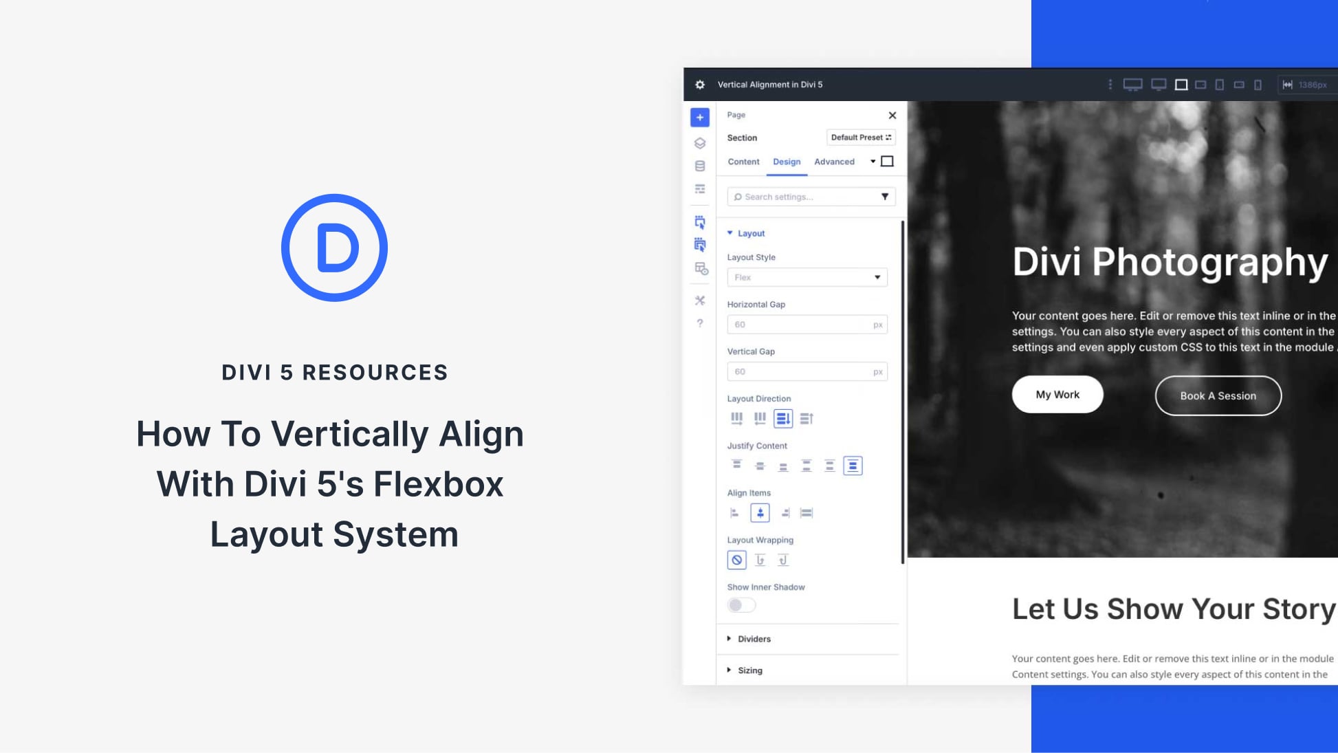
Before diving deeper, ensure you have access to Divi 5. Once you’ve set that up, familiarize yourself with the builder interface. The Flexbox settings are found within the design tab of the row or module settings where you want to apply vertical alignment.
Setting Up Your Flexbox Container
-
Select Your Row or Module: Begin by choosing the row or module in which you want to work. You can do this by clicking on the settings icon.
-
Enable Flexbox: In the settings panel, navigate to the “Advanced” tab. Look for the CSS settings and enable the Flexbox layout. This makes all the magic happen.
- Define Flex Direction: Choose the direction of your flex items. You can set it to either row (horizontal alignment) or column (vertical alignment). For vertical arrangements, select column.
Aligning Items Vertically
With your Flexbox container set, you can now align items vertically with ease:
-
Alignment Properties: In the same settings panel, you’ll see options for aligning items. Use the “Align Items” feature to specify how you want your content positioned. The available options typically include:
- Flex Start: Aligns items to the start of the container.
- Flex End: Aligns items to the end.
- Center: Centers items in the available space.
- Baseline: Aligns items based on their baseline.
- Stretch: Stretches items to fill the container.
- Setting Justification: You can further enhance the visual hierarchy by adjusting the “Justify Content” settings. This controls the spacing between your flex items. Options include:
- Space Between: Distributes items evenly, allowing for space between each one.
- Space Around: Distributes space around each item, giving them room to breathe.
- Space Evenly: Ensures equal space around all items.
Responsive Design with Flexbox
One of the key benefits of using Divi 5’s Flexbox system is the inherent responsiveness it provides. As you adjust your layout, ensure that your flex properties can adapt seamlessly to different screen sizes:
-
Media Queries: While Flexbox is responsive by nature, you might want to use media queries for fine-tuning. Thus, consider changing alignment options or directions for different breakpoints.
- Preview Settings: Utilize the preview options in Divi to see how your design translates across various screen sizes—from mobile phones to desktop displays. Make necessary adjustments directly in the builder.
Advanced Customization
For designers seeking more nuanced control over their layouts, Divi 5 supports custom CSS alongside Flexbox properties. You can take advantage of this by adding unique styles directly to your modules or rows. This gives you the freedom to enhance flexibility beyond predefined settings.
-
Custom CSS Classes: Apply custom classes within your row or module settings for targeted CSS styles. This can be useful for special hover effects or animations.
- Overriding Default Styles: You may need to override some default styles to achieve the precise look you want. Keep your CSS clean and organized by documenting any changes you make.
Best Practices for Flexbox Layouts
To ensure optimal performance and a polished look, consider these best practices when using Divi 5’s Flexbox system:
-
Limit Complexity: Simplified layouts often yield better performance. Avoid deeply nested Flexbox containers unless necessary.
-
Use Grids Sparingly: Flexbox works incredibly well for aligning items, but it’s not always ideal for grid layouts. When a grid structure is necessary, consider combining Flexbox with CSS Grid for the best results.
- Test Extensively: Always perform user testing and consider feedback from real users. This helps identify potential issues with alignment or spacing that may not be apparent during initial design stages.
Troubleshooting Common Issues
Even seasoned designers can run into challenges while using Flexbox. Below are common issues and how to resolve them:
-
Unexpected Spacing: If elements aren’t aligning as expected, check for default margins or paddings that might interfere with your layout. Adjust these in the design settings.
-
Items Not Stacking: If elements aren’t stacking vertically despite setting Flex Direction to column, ensure that the height of the parent container is sufficient for your content.
- Alignment Problems: For alignment issues, revisit your alignment and justification settings. Sometimes, small changes can significantly alter the layout.
Conclusion
Mastering the Flexbox layout system in Divi 5 can elevate your web design skills, allowing you to create engaging, responsive layouts with minimal effort. By following the tips and techniques outlined in this guide, you’ll be well on your way to designing visually appealing websites that align with modern design standards. Test, adjust, and refine your layouts to achieve the best results, and enjoy the creative freedom that Divi 5 offers with Flexbox.

