
Blog
How To Reorder Elements On Different Breakpoints In Divi 5
Introduction to Element Reordering in Divi 5
Divi 5 has transformed the web design landscape, offering users a powerful framework to create stunning websites with ease. One of the standout features is the ability to reorder elements at different breakpoints. This flexibility allows designers to tailor the layout of their site to various device screens, ensuring an optimal user experience. In this guide, we’ll explore how to effectively reorder elements across various breakpoints using Divi 5.
Understanding Breakpoints and Their Importance
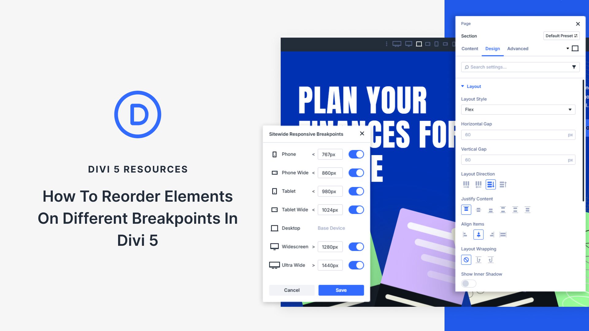
What Are Breakpoints?
Breakpoints are specific screen sizes at which your website’s layout adjusts to provide the best viewing experience. This adaptive design technique is essential for creating responsive websites that look great on desktops, tablets, and smartphones.
Why Are Breakpoints Important?
Implementing breakpoints allows you to maintain the functionality and aesthetic appeal of your site across different devices. Without proper breakpoints, your website may appear cluttered or unorganized on smaller screens, leading to a poor user experience.
Getting Started with Divi 5
Before you dive into reordering elements, ensure you have the latest version of Divi 5 installed and activated on your WordPress website. Once you’re set, follow these steps to begin customizing your layouts.
Accessing the Divi Builder
- Open Your Page: Log in to your WordPress admin panel and navigate to the page you want to edit.
- Enable the Divi Builder: Click the "Enable Divi Builder" button. This feature allows for drag-and-drop editing, making it easier to visualize changes as you make them.
Elements in Divi 5: An Overview
Divi offers a wide array of elements that can be reordered. Understanding these components is crucial for effective page design:
Common Elements in Divi
- Text Modules: These allow you to add descriptive content.
- Image Modules: Perfect for visuals, enhancing aesthetic appeal.
- Button Modules: Help in driving user action and engagement.
- Gallery Modules: Showcase multiple images in a grid or slider format.
Each of these elements can be reordered based on your design requirements, ensuring an appealing layout on any device.
Reordering Elements: Step-by-Step Guide
Step 1: Identify Your Layout
Begin by sketching out the desired layout for different screen sizes. Determine what elements you want to emphasize on mobile versus desktop views. This planning stage is critical for successful implementation.
Step 2: Open Settings for Each Module
- Select the Module: Click on the element you wish to reorder.
- Open Settings: A settings menu will appear, allowing you to modify various options related to that module.
Step 3: Utilize the Advanced Tab
- Navigate to the Advanced Tab: Within the module settings, locate the "Advanced" tab. This area provides additional configuration options.
- Find the Visibility Settings: Here, you can set which elements should be visible or hidden at specific breakpoints.
Step 4: Adjust the Layout Order
-
Use the Custom CSS Feature: To reorder elements, you can utilize the custom CSS section. Here, you can assign classes or IDs to your modules, which will help you in targeting them for reordering.
-
Implement CSS for Responsive Design: You can use basic CSS to change the order of elements. For instance:
css
@media (max-width: 768px) {
.element-class {
order: 1; / Adjust order for mobile view /
}
}
Step 5: Preview and Adjust
After making your adjustments, preview your site on various devices to see how the reorder looks. Divi provides live previews, making this step straightforward. Be sure to adjust the order until you’re satisfied with how everything appears.
Utilizing Built-In Features
Divi 5 comes with built-in features that can simplify the process of rearranging elements across breakpoints.
The Visual Builder
The Visual Builder in Divi allows for real-time adjustments. By simply dragging elements around, you can instantly see how they will appear on various devices. This feature eliminates the need for extensive coding knowledge, making design accessible to all users.
Responsive Editing Options
You can directly switch between device views within the Visual Builder. Clicking on the mobile icon gives you a quick view of how the layout adjusts at each breakpoint, enabling instant tweaks.
Save Your Changes
Once you’re satisfied with the layout changes, remember to save your work. Click the green “Save” button, and don’t forget to publish or update your page to ensure all modifications are live.
Troubleshooting Common Issues
Elements Not Appearing as Expected
If elements don’t align or appear incorrectly after reordering, double-check your CSS for errors. Make sure you’re targeting the correct classes and that there are no conflicting styles.
Enhancing Load Times
Reordering may sometimes affect page load speed, especially if high-resolution images are involved. Optimize images properly to ensure fast-loading pages.
Best Practices for Effective Reordering
Keep User Experience in Mind
Always prioritize usability. Ensure that key content is easily accessible on mobile devices where screen real estate is limited.
Test Across Multiple Devices
It’s essential to test your changes across various devices and browsers. What looks good on one screen may not fit well on another.
Be Mindful of Accessibility
Ensure that your reordered layout remains accessible to all users, including those utilizing assistive technologies.
Conclusion
Reordering elements in Divi 5 across different breakpoints is a powerful tool in web design. By following the steps outlined in this guide, you can create a responsive, user-friendly website tailored to each viewer’s device. With practice, you’ll find that these adjustments enhance both aesthetic appeal and functionality, delivering an exceptional browsing experience to all visitors.
Dive into Divi 5 today and start transforming your website layout with ease!

